Redesigning How Users Create Studies on GetCurious
Redesigned the task creation for unmoderated studies that reduced user drop-offs and increased study completions by ~25%.

Responsible for driving initial research, proposing the project, conceptualisation, design, usability testing, dev handoffs, and delivery of key modules and feature areas.
Me working as a solo product designer with a product manager, engineers, and customer support team.
B2B SaaS, Web, Research
August 2023 - October 2023
GetCurious is a user testing platform built for UX researchers, designers, and product managers to conduct research studies, observe real user interactions, and gather valuable feedback.
🚩 The Problem: Users Relied on Support to Create Studies
But despite this, something wasn’t working. By June 2023, we noticed an emerging pattern:
I connected with the support team to pinpoint exactly where users were getting stuck. The answer was clear:
📊 Understanding the Scope: How Big was the Problem?
I analyzed support ticket trends, Hotjar sessions and Onboarding funnel data. The data revealed:
🎯 Defining Success: What did we Aim to Achieve?
🎊 The Impact: 12 new Product Teams adopted GetCurious within 3 months of new release
each team is bringing dozens of users onboard and expanding the platform's reach. The teams cited the new study creation experience as the key driver.
Overall Business Impact
Reduction in support tickets related to study creation
Studies created independently by users
Increase in successful completed studies
User Impact
Decrease in average study creation time
Participants performed in new studies created
Month-over-month user growth
🧪 Usability Testing to Minimize Guesswork
⭐️ Usability Findings: Where Users Struggled Most
Two types of insights we filtered out from our usability sessions.
Platform Insights
Below, image indicating places of issues in old task page design
Additional Insights/ Feedbacks
• Limited task types
• No task previews during creation
• No way to test static images
• Frequent edits post-launch due to unclear tasks for participants
💡 Strategy: Prioritize What Matters Most
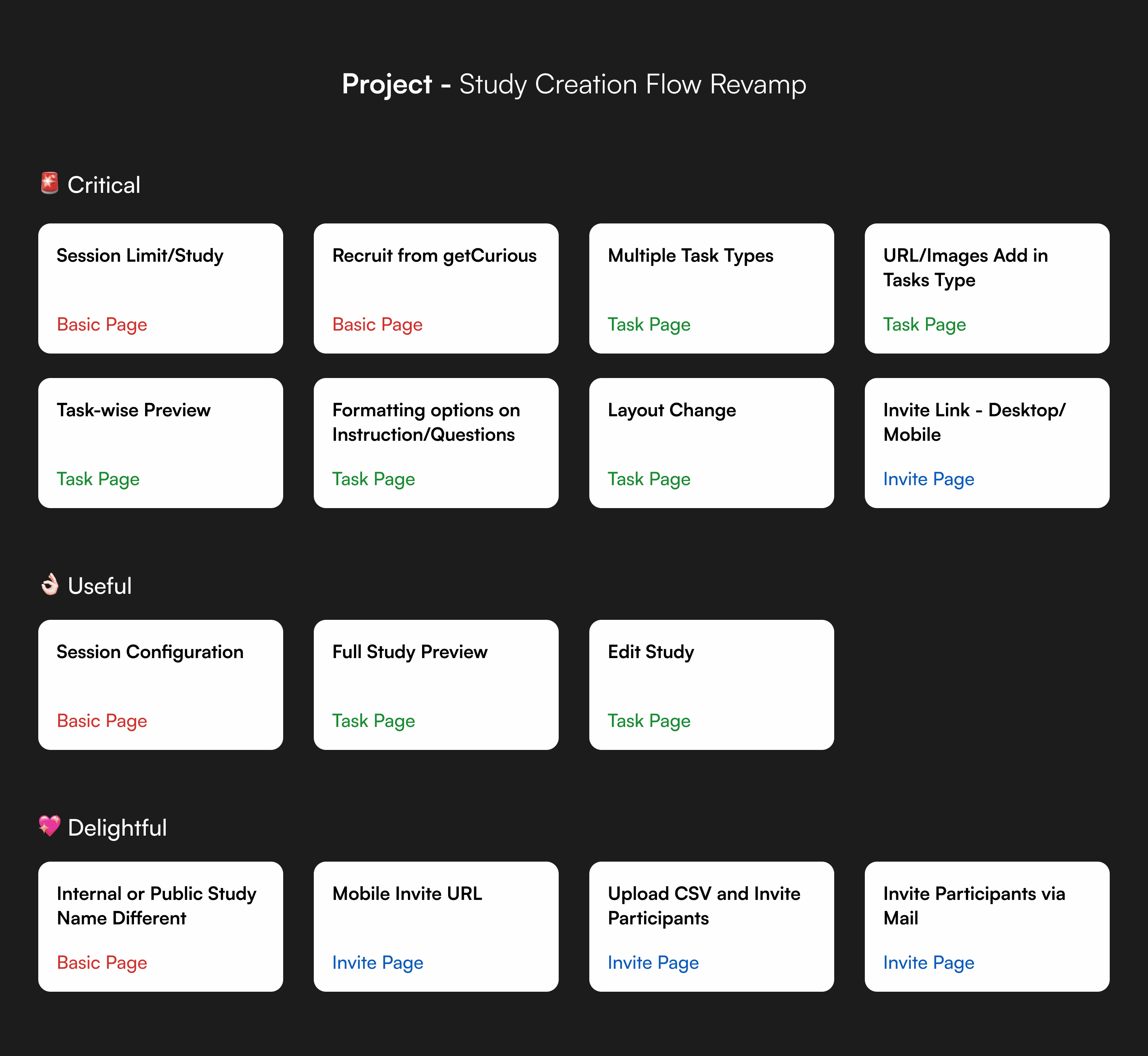
The roadmap focused on three areas:
1. Designing the Clean, Focused Task Creation Page
2. Introducing New Features
3. Refine with AI: Helping Users Write Better Tasks
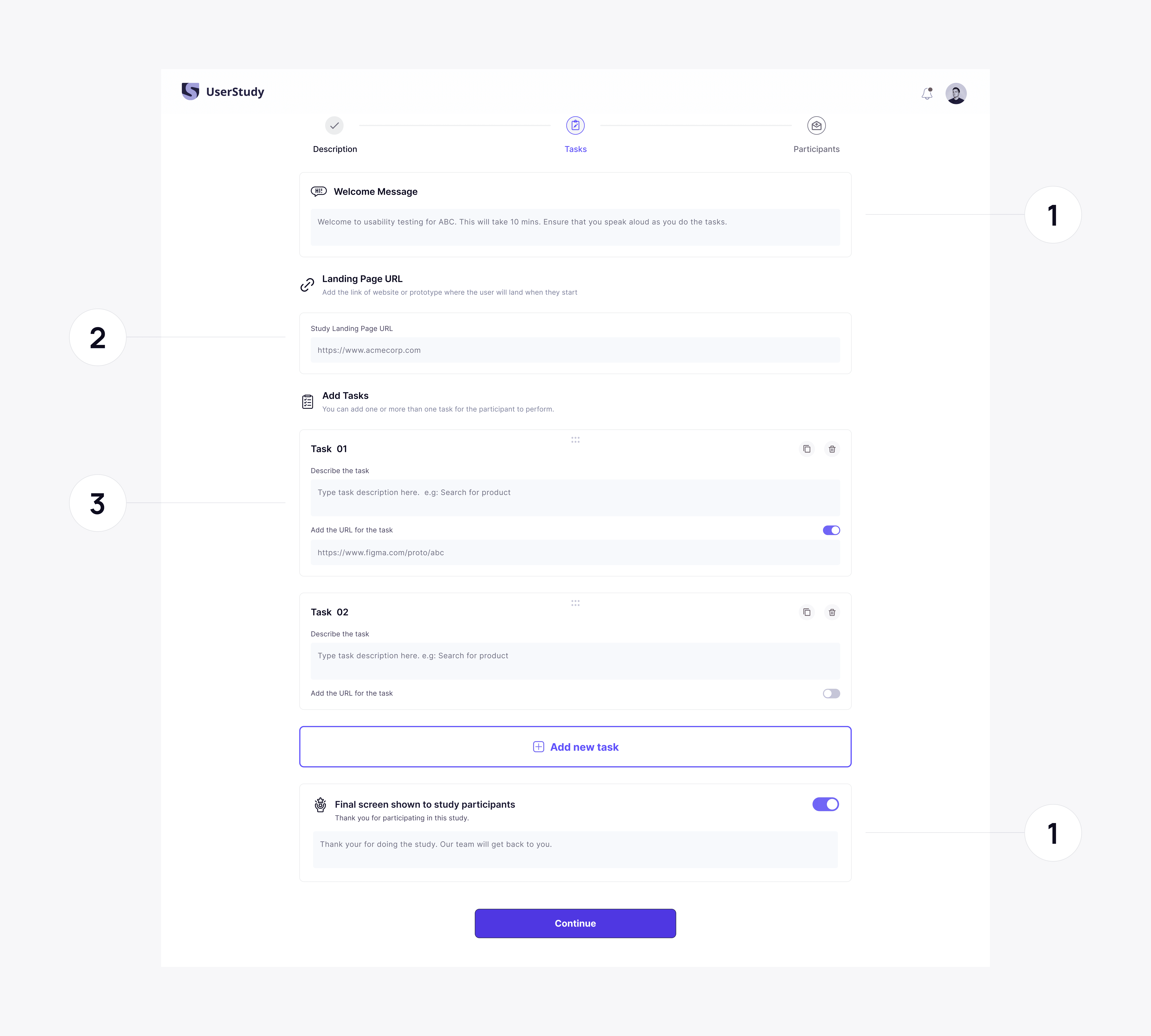
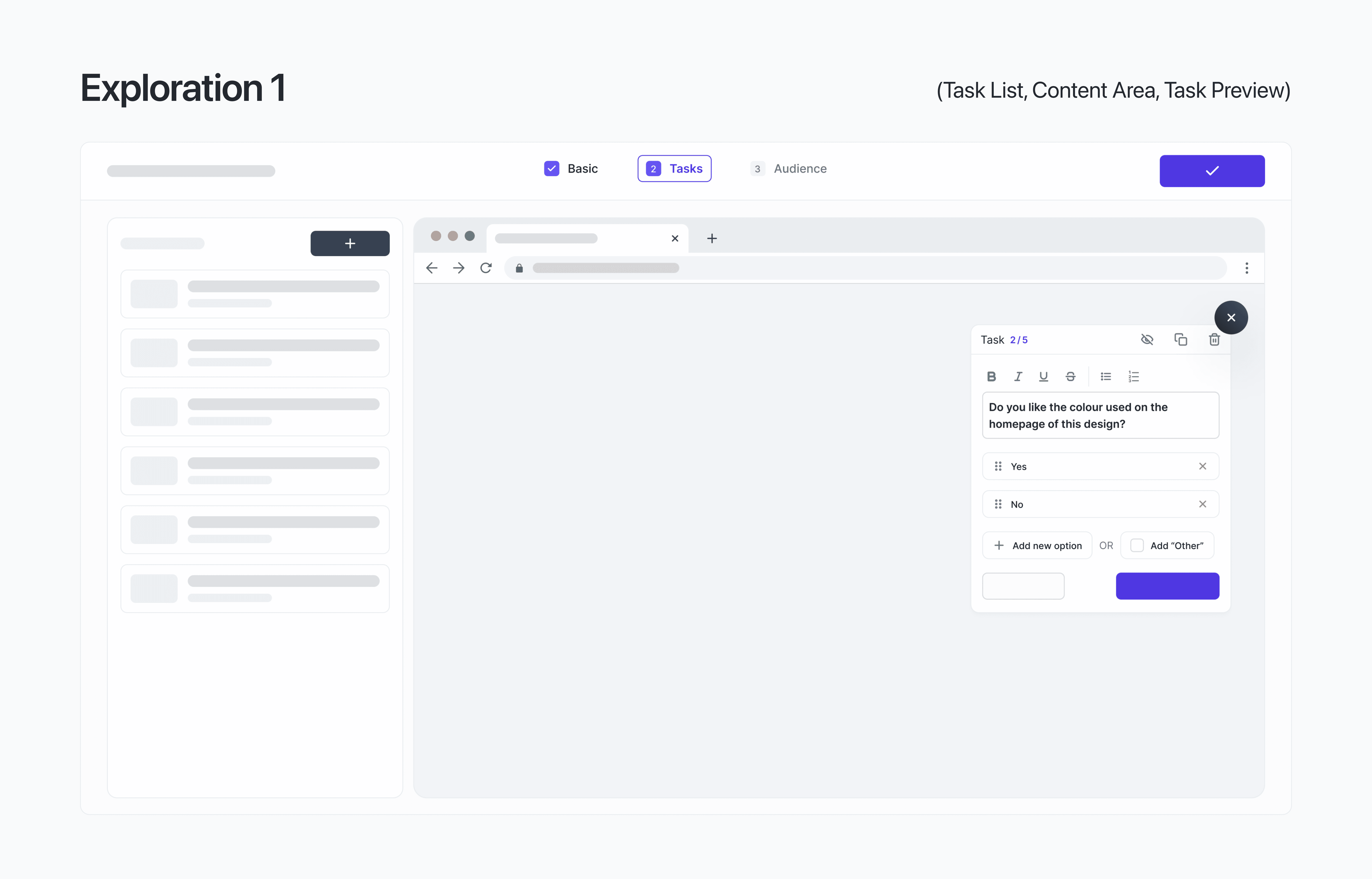
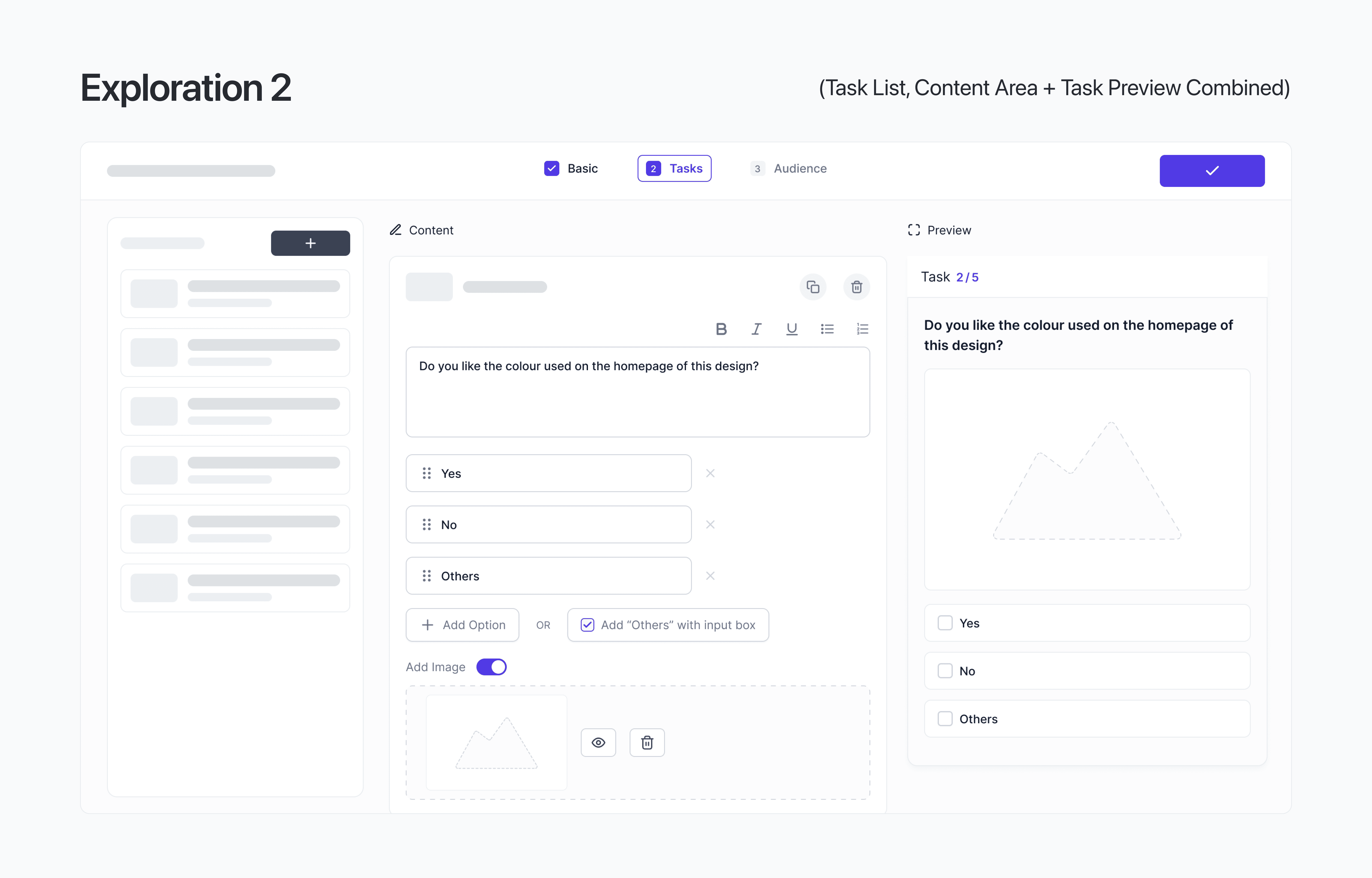
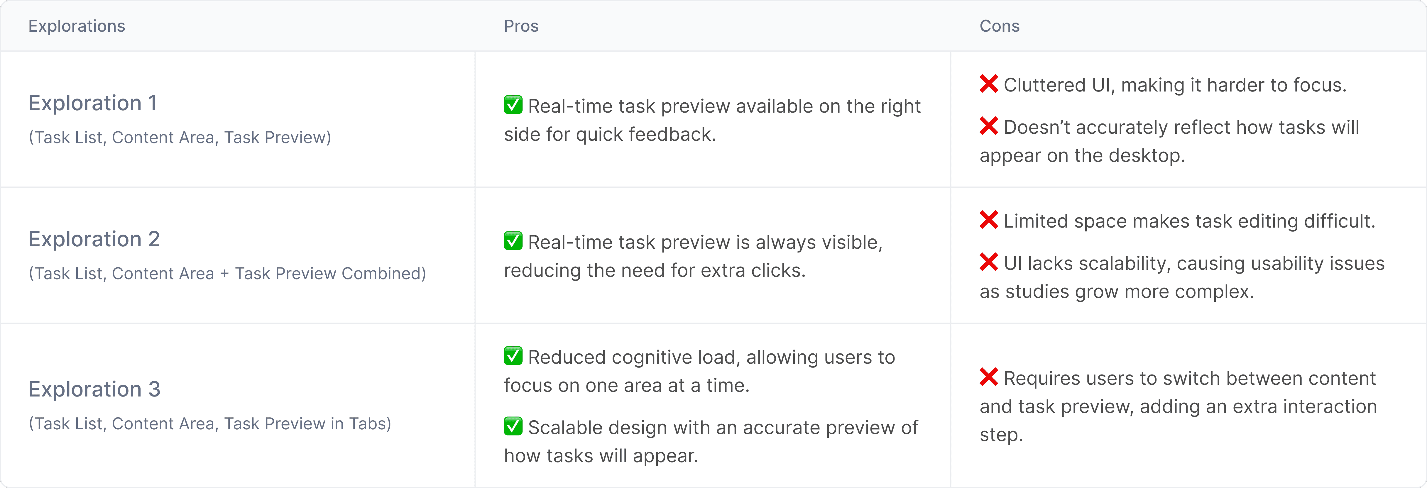
✍🏼 1. Designing the Clean, Focused Task Creation Page
We redesigned the Task Page from the ground up with three distinct sections:
I explored multiple layout options, identified three standout designs, and conducted quick feedback sessions to gather insights.

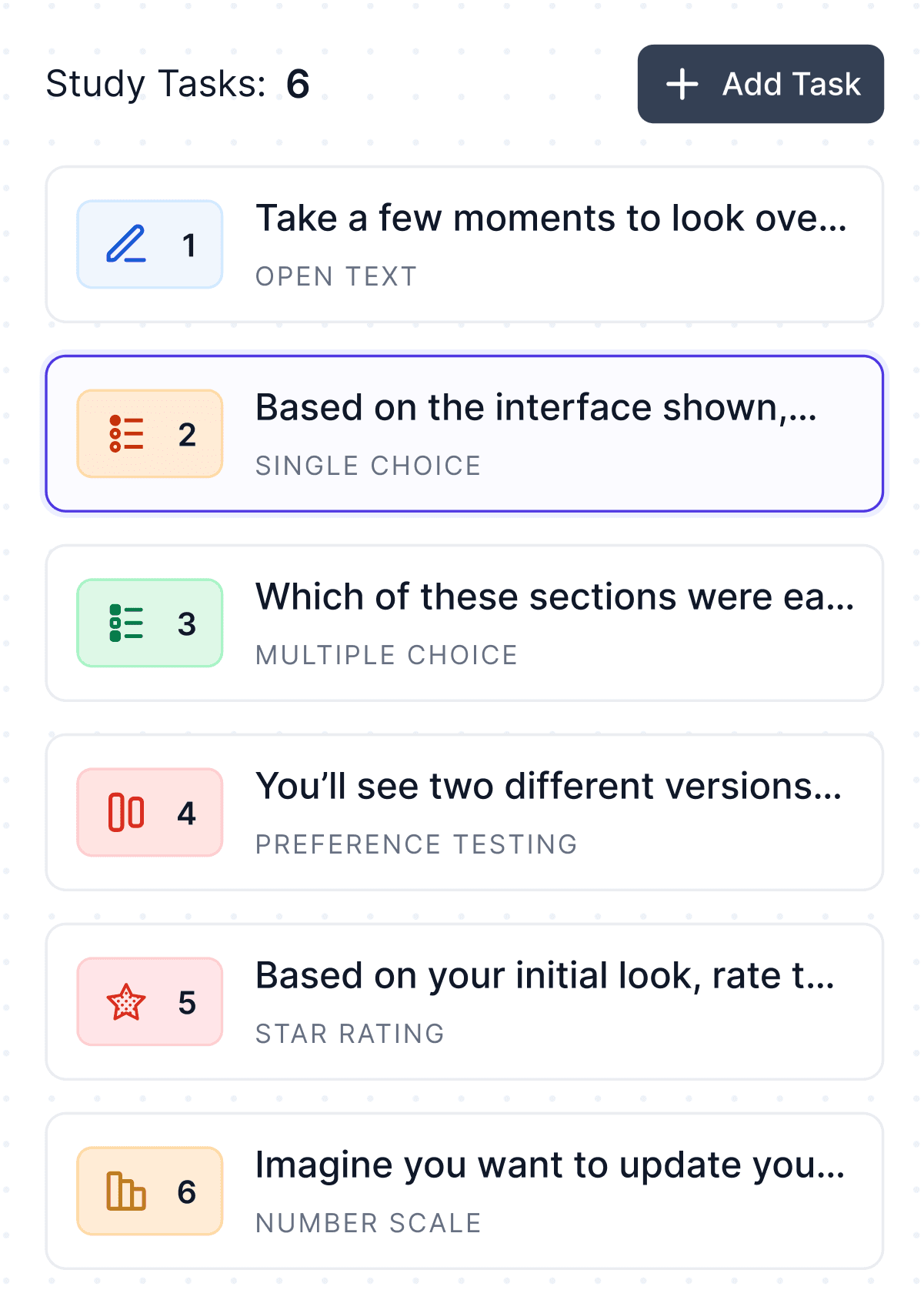
🧩 2. Introducing New Features
🆕 2.1 New Task Types

🔄 2.2 Easier Task Management
Rearranging tasks was hard and frustrating due to large task boxes.
For this I have done competetive research to see how other platform solving this. One common pattern I have noticed everywhere using it is show one task at a time.
• A compact left-hand panel displaying all tasks.
• Users could quickly switch, reorder, or manage tasks.
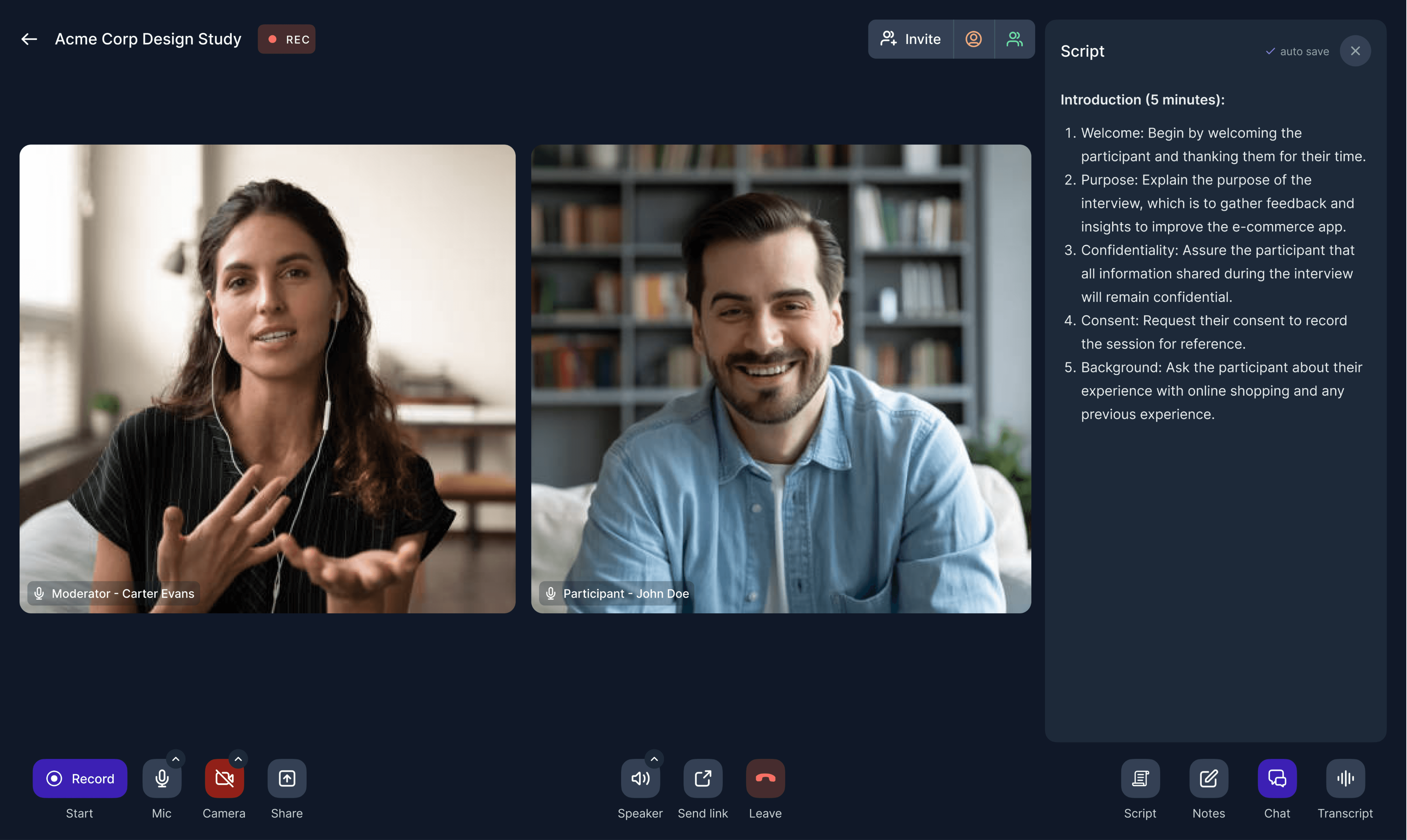
👀 2.3 Study Preview
Participants often misunderstood tasks. This led to post-launch edits and inconsistent study data.

🤖 3. Refine with AI: Helping Users Write Better Tasks
Users weren’t always confident their instructions were clear. Many over-explained, making tasks hard to follow.
• Simplify language
• Improve clarity
• Keep instructions concise
🧐 Hmm... Does this solve the problem?
The layout and overall experience felt much better now by users. The above changes we made make a huge difference to what existed before, and we felt we were close to our goals.
🔁 Iterations Based on User Behaviour
From Hotjar sessions and follow-ups, we uncovered two major pain points:
⛳️ 1. Inline Error Feedback
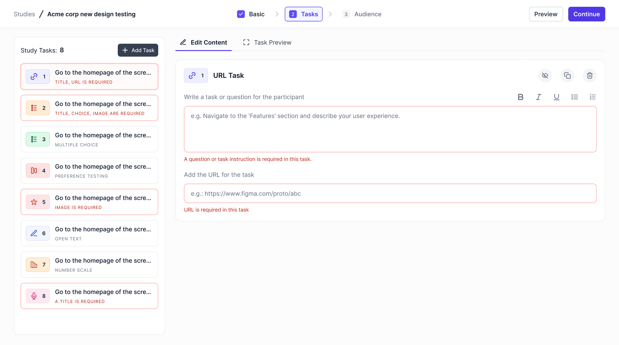
🫣 2. Hidden Actions - Delete, Duplicate, or Hide a Task
We placed these action buttons in the top right corner of the content box, but some users had difficulty finding them.
💭 Reflections & Learnings
Clarity builds confidence
Users didn’t need more features — they needed to feel sure they were doing the right thing. Clear defaults, better previews, and validation helped remove second-guessing.
Support teams are a goldmine of insight
Talking to the support team gave us real problems, not assumptions. Their feedback helped us prioritize what actually mattered.
Small changes create big outcomes
Things like inline errors, task previews, and AI text suggestions felt minor — but they had a huge impact on usability and reduced support load.
🙌 Final Note
The overall impact of the project was positive. Nevertheless, there were tons of learnings and a lot of areas to improve upon. Feel free to reach out to know more about how we all worked together to ship the project.
For future, we had planned a lot of updates which were also shipped by the team at GetCurious after I left the team.
Thanks for reading!
I’d love to talk more about this project and the many behind-the-scenes decisions that went into it.
Thank you for reading!
More Case Studies


I'd love to grab tea to talk about anything - from design and tech to sports and anime. Shoot me an email and we can work something out.

© 2025 Abiral Jain. All right reserved.